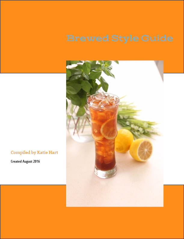
Brewed – Logo, Style Guide, and Landing Page
Case Study – Brand Design
I designed the complete brand for a fictional coffee shop. I began by asking what would make a coffee shop stand out from Starbucks and all the others? One thing I noticed while soaking in the atmosphere of local coffee shops was no children. Of course, since kids probably should avoid caffeine highs and are sometimes noisy, it makes sense for coffee shops to discourage children from entering. But where do their parents get their coffee fix?
I envisioned a coffee shop that would cater to kids and their parents – offering healthy kids’ snacks, a play area, and a happy, relaxed atmosphere. A place where moms could meet for coffee with friends after picking up the kids from school, and a work-from-home dad could chat with colleagues while his one-year-old sleeps in the stroller. It would also offer extra touches like wide walkways, ramps, and handicap bathrooms for those with special needs.
I chose the name BREWED for this company, for the coffee and tea it would serve as well as being a homonym for BROOD, to emphasize the welcoming aspects for large families and anyone with kids.
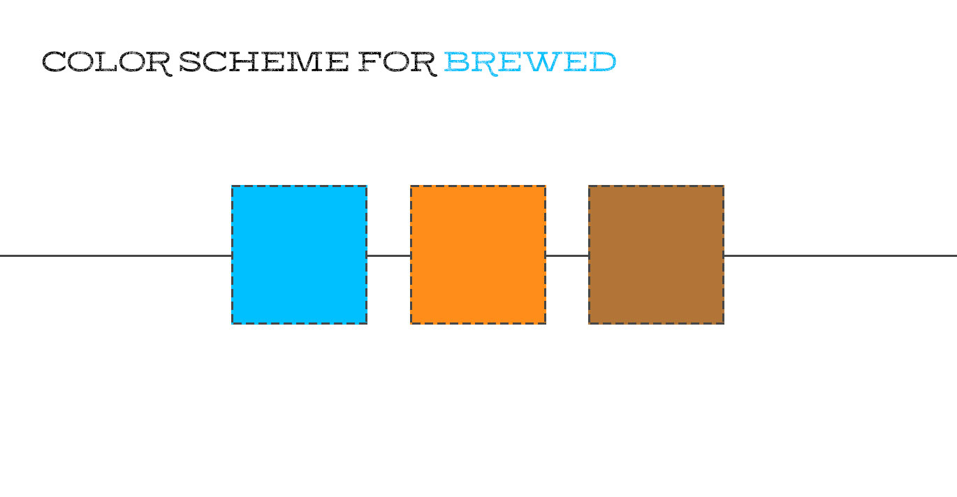

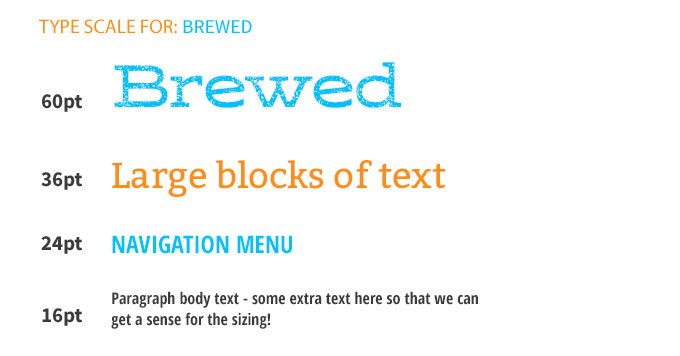
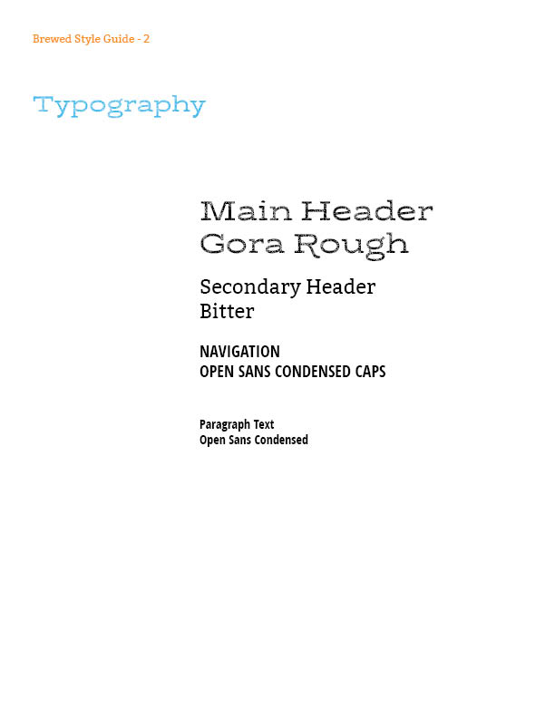
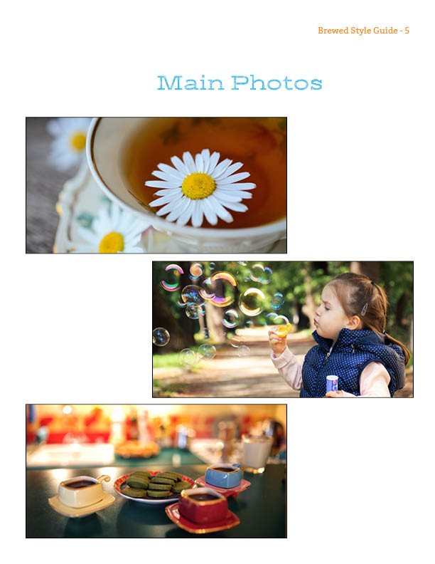
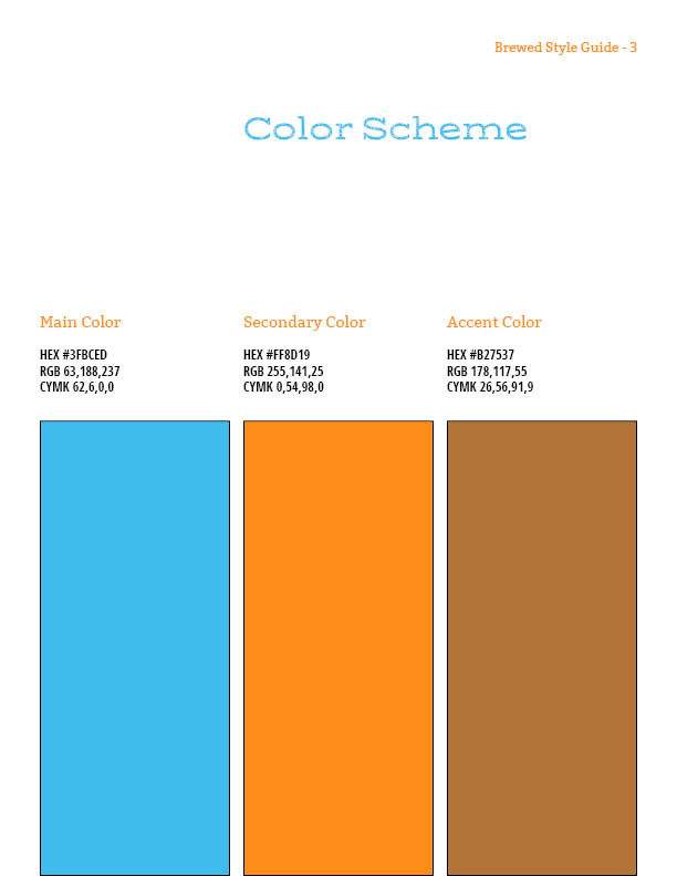
I pulled all of the branding elements together to create this style guide to serve as the foundation for the entire brand.

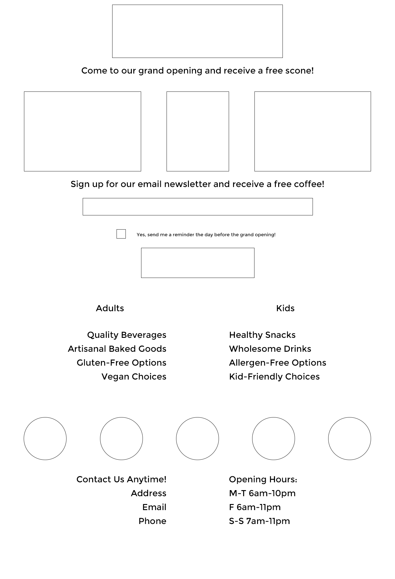
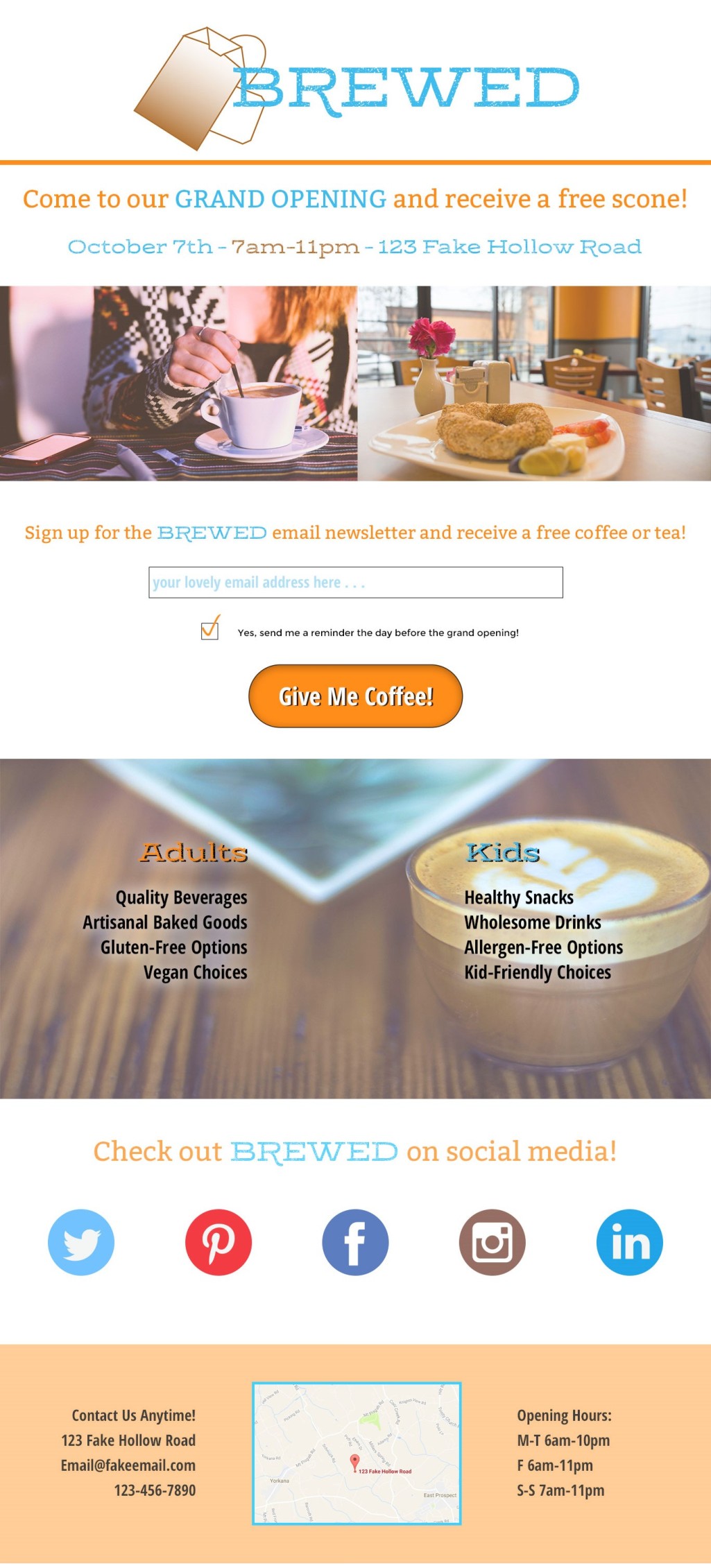
My final task was using the brand elements I had created in a landing page for the grand opening of the shop, complete with an offer to entice people to stop by that day and sign up for the email newsletter. Using landing page principles, I began with a wireframe of the landing page to help envision the layout.
After completing the wireframe, I designed the first draft of the landing page in Photoshop. Below is the initial version before feedback and revisions.
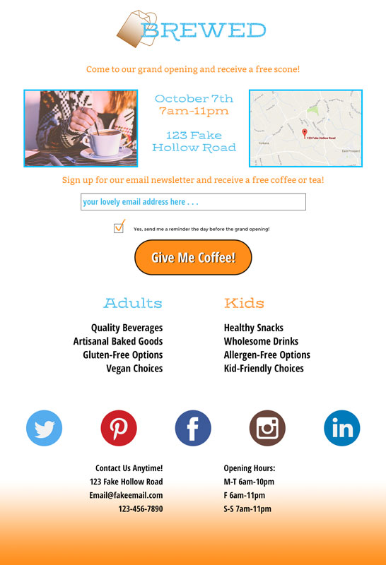
Scroll down to see the finalized landing page after feedback from others and multiple revisions. It was the last piece of this particular branding project, but these same elements and branding assets can be used for additional landing pages, print products, and a full website design.